
Your analytics dashboard tells you that a page gets thousands of visits but barely any conversions. Great. So what now? The numbers tell you what happened, but they go quiet on the question you actually care about: why. That gap is exactly where heatmaps walk in.
Heatmaps and traditional analytics are not rivals. They answer different questions. One counts behavior, the other shows behavior. When you understand the difference between heatmaps vs traditional analytics, you stop guessing and start seeing.
Let’s break this down together. We will cover what each one does, where each one falls short, and when you actually need both.
Quick Comparison: Heatmaps vs Traditional Analytics
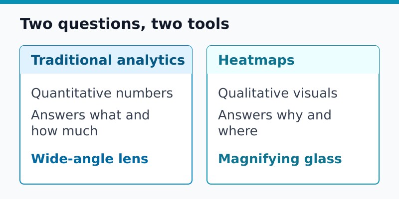
| Traditional Analytics | Heatmaps | |
|---|---|---|
| Data type | Quantitative (numbers) | Qualitative (visual) |
| Answers | What and how much | Why and where |
| Scope | Whole site, all sessions | Single pages, sampled sessions |
| Best for | Trends, traffic, conversions | Layout, friction, attention |
| Output | Charts and tables | Color overlays on a page |
In short, traditional analytics is your wide-angle lens and heatmaps are your magnifying glass. Now let’s look at each one properly.
What Traditional Analytics Does Well
Traditional analytics is the backbone of measurement. It counts sessions, tracks where visitors come from, follows them across pages, and records conversions. It works across your entire site, all the time, for every visitor.
This is where you turn for the big questions:
- Where is my traffic coming from? Search, social, referrals, or direct.
- Which pages pull the most visitors? Your top performers and quiet underdogs.
- How many people convert? Sign-ups, sales, downloads, whatever your goal is.
- How are trends changing over time? Month over month, season over season.
Here’s the thing, though. Traditional analytics is fantastic at counting and terrible at explaining. It can tell you a page loses visitors, but it cannot show you that everyone is rage-clicking a button that does nothing.
What Heatmaps Do Well
A heatmap is a visual layer on top of a page that shows how people interact with it. Warm colors mark heavy activity, cool colors mark neglected zones. Suddenly you can see behavior instead of just reading about it.
There are a few common types:
- Click maps show where people tap or click, including spots that are not even clickable.
- Scroll maps reveal how far down the page people actually travel before they bail.
- Move maps track cursor movement, a rough proxy for where eyes wander on desktop.
- Attention maps highlight the sections that hold focus the longest.
This is gold for fixing layout and friction. Maybe your call to action sits below the point where most people stop scrolling. A heatmap shows that in a glance, while traditional analytics would just leave you scratching your head over a weak conversion rate.
Where Each One Falls Short
Neither tool is the whole answer. Knowing the limits keeps you from leaning too hard on one.
Traditional analytics struggles with:
- The reason behind a number. It reports the symptom, not the cause.
- On-page behavior, like which element grabbed attention.
Heatmaps struggle with:
- Scale. They cover individual pages, not your whole site at once.
- Trends over time. A heatmap is a snapshot, not a timeline.
- Low-traffic pages. With too few sessions, the colors mean very little.
That is the real takeaway. Each tool is blind exactly where the other one sees clearly.
When You Actually Need Both
So when does it make sense to run both? The honest answer is: when a number raises a question you cannot answer with more numbers. The smart workflow looks like this.
- Start with traditional analytics to find the problem page. Maybe a key landing page leaks visitors.
- Switch to a heatmap on that exact page to see the behavior behind the drop-off.
- Form a hypothesis from what you see, like a hidden button or a confusing layout.
- Make a change, then return to traditional analytics to confirm the numbers moved.
You do not need both on every page, every day. You need them as a one-two punch on the pages that matter. This pairs neatly with the idea of using analytics to improve UX rather than just collecting numbers for their own sake.
A Note on Privacy
Here is something worth flagging. Some heatmap tools record detailed sessions, which can sweep up sensitive interactions. Before you roll one out, check how it handles personal data and whether it masks form fields.
If privacy is a priority for you, look for heatmap tools that anonymize input, avoid recording keystrokes, and respect consent choices. The same care you put into privacy-conscious analytics should extend to your behavioral tools too. For a broader view of regulation, the official GDPR resource is a useful reference.
Which Should You Choose?
If you can only run one, run traditional analytics. It is the foundation, and you cannot manage what you do not measure. Heatmaps are the powerful add-on you reach for when you need to understand a specific page.
- Choose traditional analytics first for site-wide measurement and trends.
- Add heatmaps when conversion problems need a visual explanation.
- Use both together for high-value pages where every percent counts.
Bottom Line
Heatmaps vs traditional analytics is the wrong way to frame it. They are partners, not competitors. Traditional analytics tells you what is happening across your site. Heatmaps show you why it is happening on a page. Together, they turn vague numbers into clear action.
No fluff, just straight answers. Start with the numbers, dig with the visuals, and let each tool do the job it was built for. That is how you stop guessing and start fixing.

Leon Bauer
Explorer of web analytics and digital measurement tools. I dive deep into features, limitations, and use cases of platforms like Google Analytics, Matomo, Plausible, and others. My mission is to demystify analytics through honest reviews and practical guides.
More about me →